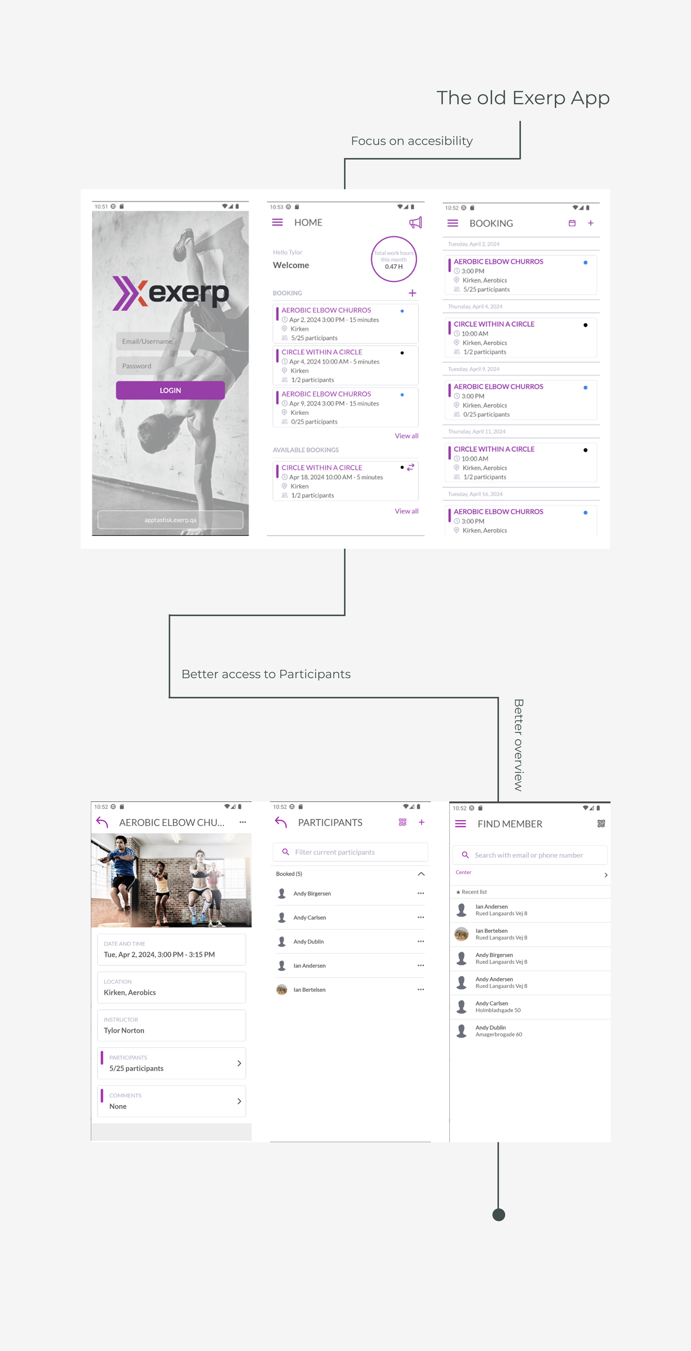
Built on user insights
Through interviews with managers and trainers, we identified key requirements and preferences that shaped the redesign — from easier scheduling to flexibility in managing classes and members.
A timeless and adaptable design
The new design follows best practices to ensure simplicity and longevity, while also allowing each fitness provider to adapt the app’s color scheme to their brand identity.
Tested for usability
The redesigned app was validated through usability testing with end users, ensuring that it not only looked modern but also supported instructors and trainers in their daily tasks more effectively.
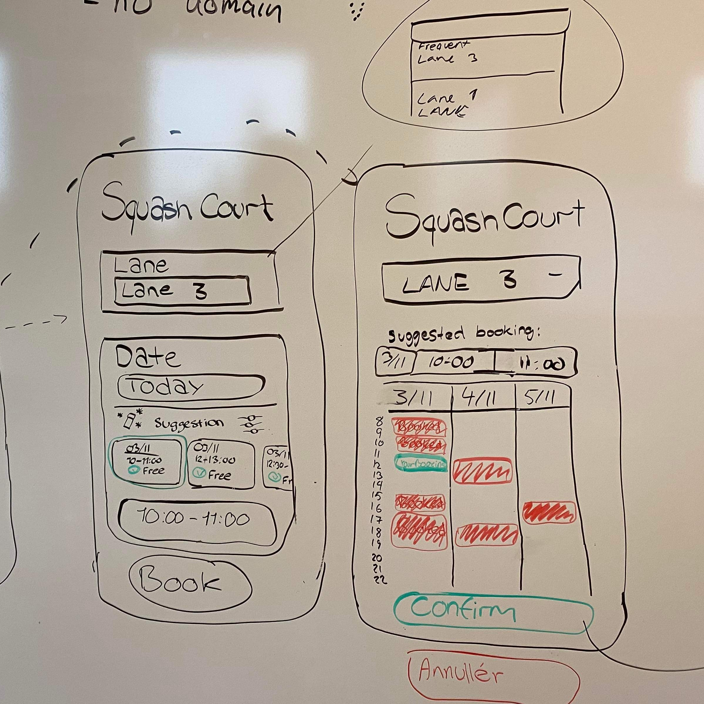


Process
Discovery
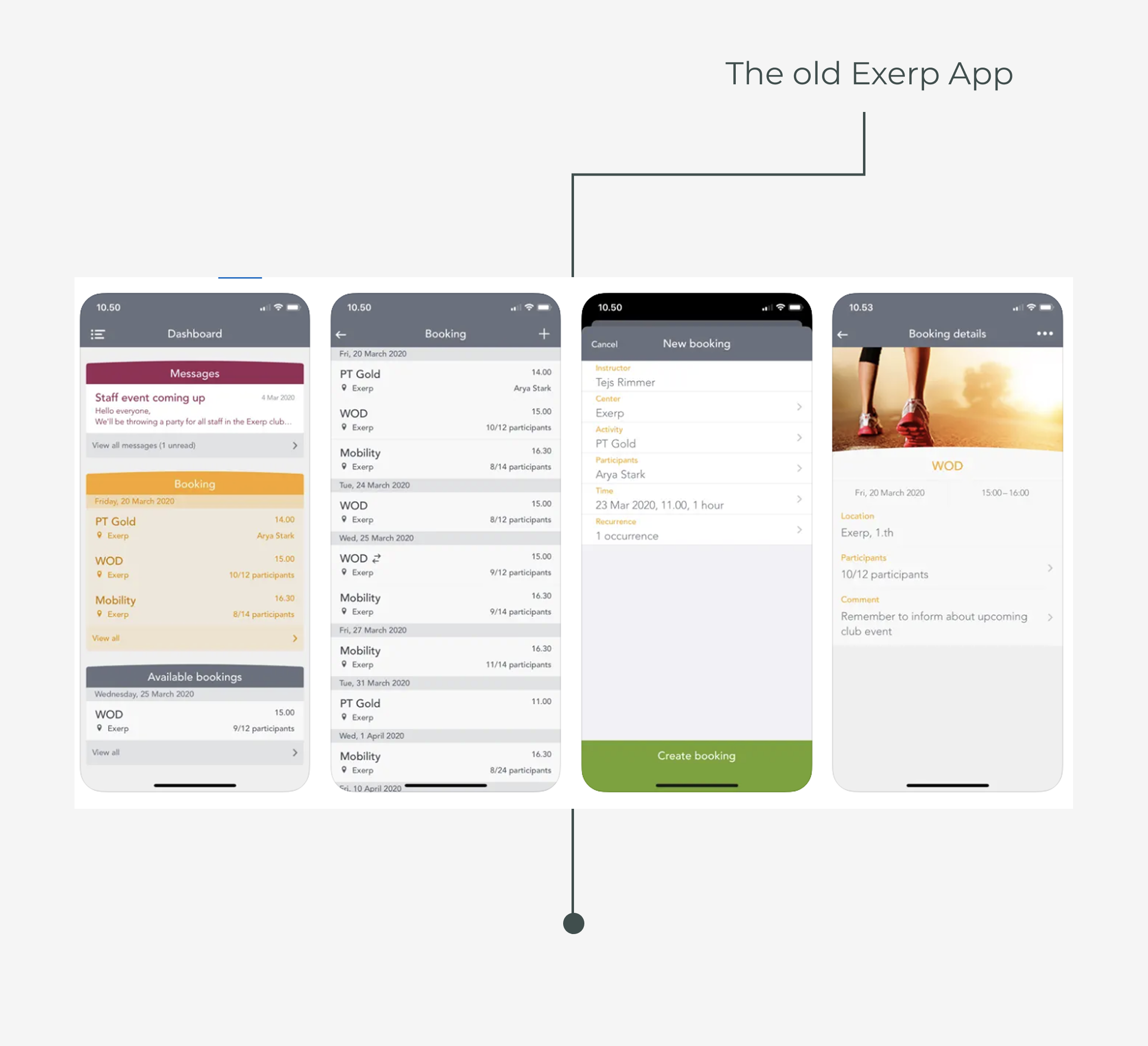
The Staff Mobile App was originally created to help instructors and trainers manage classes, bookings, and members, but the existing version had become outdated in both style and usability. Since Exerp did not yet have a dedicated design department, I was a part of modernizing the app and align it with design best practices.
Analysing
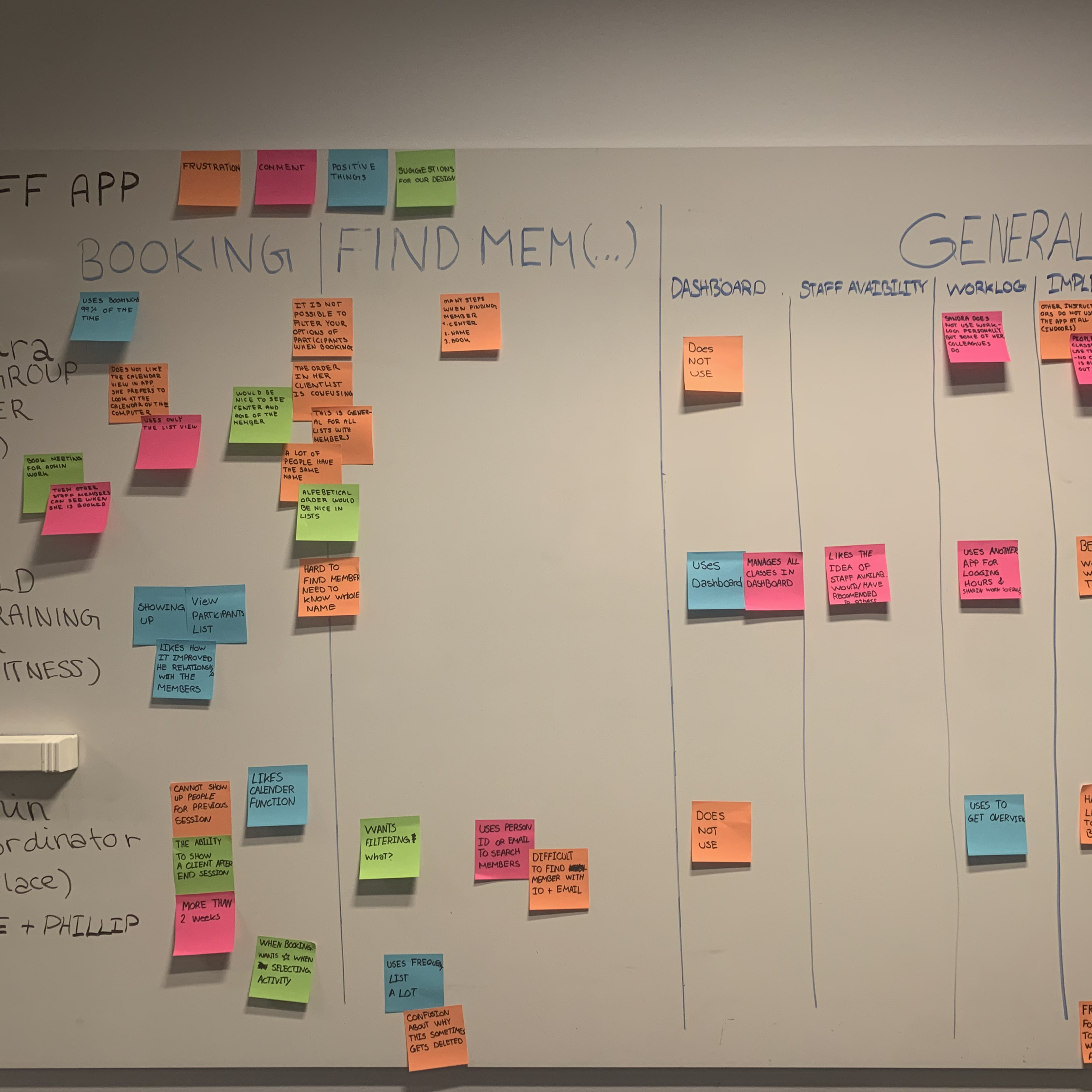
To understand the needs of real users, we conducted interviews with managers and trainers who either used the app themselves or supported others in using it. These conversations revealed requirements such as easier scheduling, clearer overviews of appointments, and a more intuitive way to swap or sign up for classes. We translated these insights into design criteria that guided the redesign.
Testing
Once the new interface was developed, we carried out usability testing with instructors and trainers to validate our decisions. Two main criteria were central to the redesign: the app should be simple and timeless in its design, and the UI should easily adapt to each client’s color scheme. The testing confirmed that the updated design not only improved usability but also provided the flexibility and professional look Exerp’s customers needed.