Clear and accessible information
We restructured the website to ensure that both volunteers and parents can quickly find the answers they need. By reducing confusion and making content more intuitive, Madskoler staff now spend less time handling repetitive questions via phone, email, and social media.
Streamlined registration
The instructor sign-up process was simplified and made more intuitive, supporting recruitment and retention. A clearer flow and improved guidance help volunteers complete registration on their own, lowering barriers for new instructors.
A modern, inviting identity
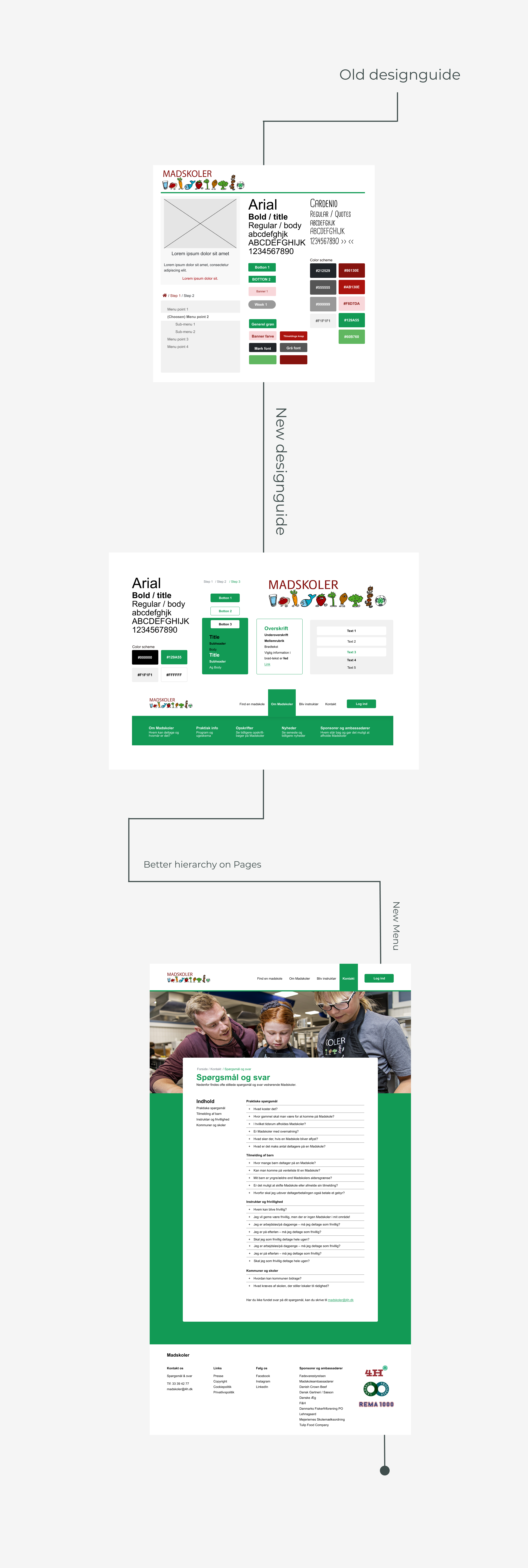
We developed a refreshed visual profile with a consistent layout, color palette, and hierarchy. The new look is more welcoming, accessible, and trustworthy, reflecting Madskoler’s role as both a professional and socially engaged organization
Focus on social sustainability
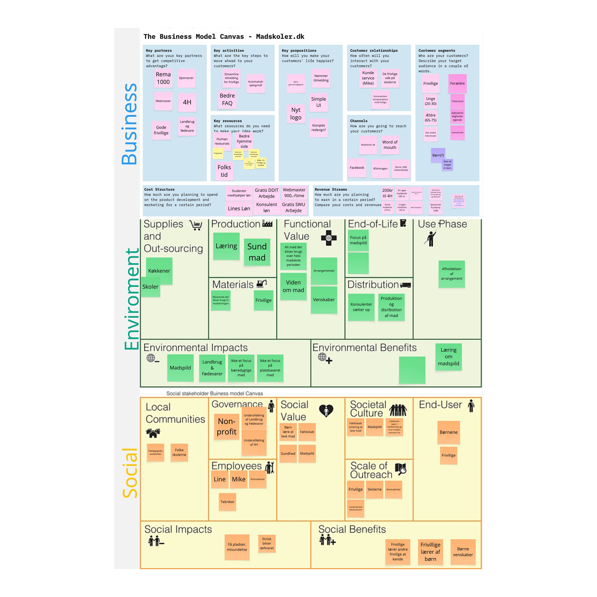
Beyond the brief, our work revealed an opportunity to position Madskoler more strongly around social sustainability. By highlighting volunteering as a meaningful community contribution, the website can attract more volunteers, deepen parent engagement, and strengthen local partnerships.

Process
Research & Insights
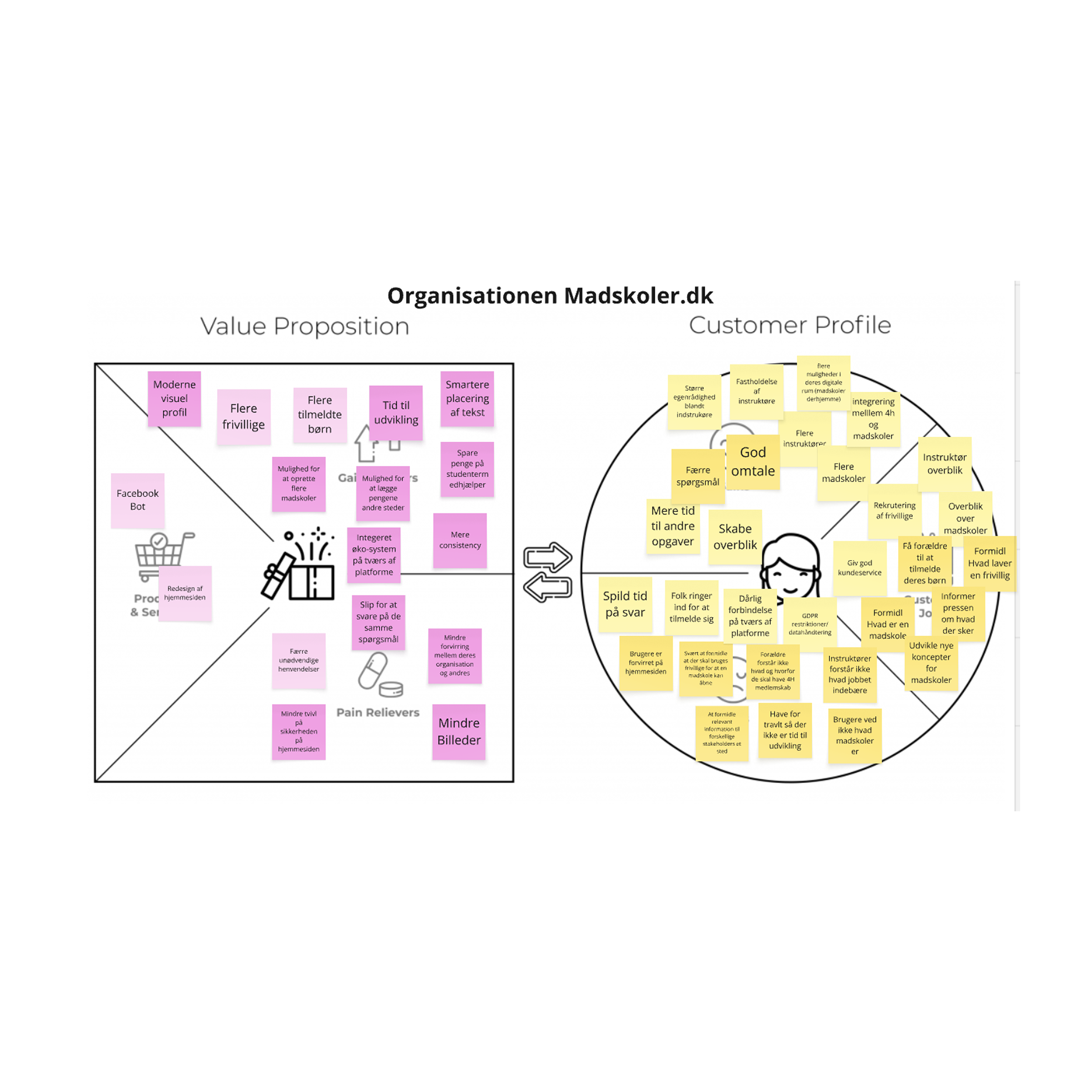
To understand the challenges with the existing website, we began by analyzing data sets provided by Madskoler and conducting initial user tests. We also performed content analysis, affinity diagramming, and empathy mapping to identify patterns in how parents and volunteers used the site.
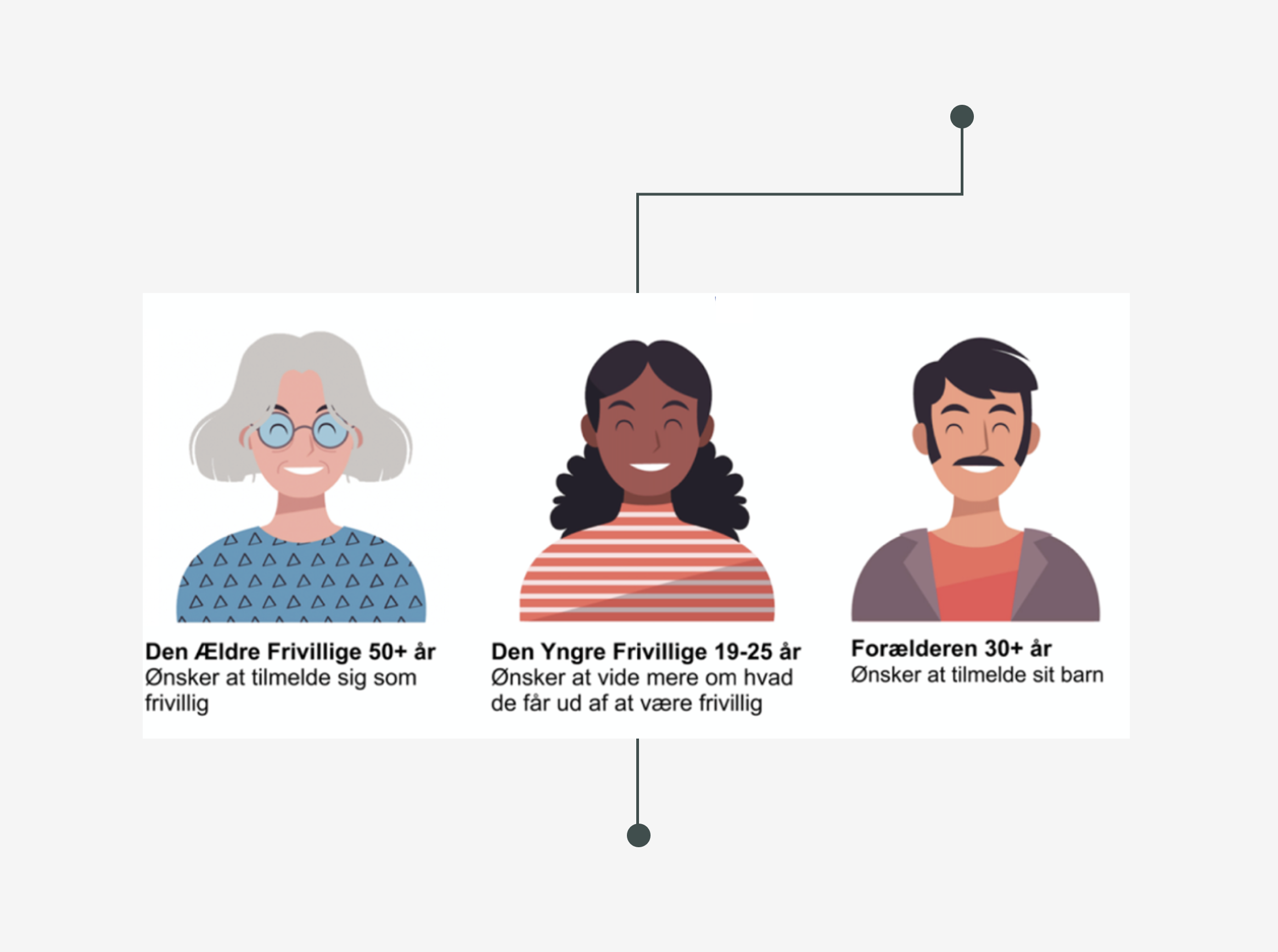
From these insights, we created three personas that guided our design decisions:
- Older volunteer seeking clear event information and consultant contact details
- Younger volunteer looking for practical information and a simple sign-up process
- Parent searching by postcode to register their child at a nearby cooking school
These personas helped us prioritize accessibility, ease of registration, and a user-friendly visual style.
Design & Testing
Based on our insights, we defined three design criteria: information should be easy to access, registration for instructors must be streamlined, and the visual identity should be modern and consistent. Using Figma, we created wireframes, built the user flow, and developed an interactive prototype.
To validate our design, we carried out usability testing sessions with volunteers and parents. Qualitative feedback was gathered through A/B testing, while Maze was used to collect quantitative data on user interactions. The results showed a clear positive impact: the perceived modern expression of the website improved from 2.8 to 3.7, and the average task completion time dropped dramatically from 5m 32s to just 57s. These findings confirmed that the redesign significantly enhanced usability — while still leaving room for further improvement.
 Anna Kløve Thystrup